Early Error Detection
Spot inconsistent typography right when it’s introduced during development.
Typography plays a critical role in shaping how users perceive and understand your content. As a project grows, inconsistencies in font sizes, line spacing, or letter spacing often creep in, making it harder to maintain a cohesive design.
This document outlines how to use standardized typography variables to boost both development efficiency and design quality. By establishing a consistent typographic style, you can deliver an intuitive reading experience and streamline team collaboration.
For example, if you have --font-lg: 1.125rem;, it translates to approximately 18px, perfect for slightly larger text that stands out from body copy.
Our default styles for headings and paragraphs provide a solid foundation. They’re designed to be visually consistent out of the box, but can still be tailored to your project’s specific needs.
h1 ~ h6)p)Below, the <TypographyPalette> custom component showcases these default styles in action.
| Label | Font Size (rem / px) | Line Height Token | Usage | Preview |
|---|---|---|---|---|
| XS | --font-xs12px | --lh-tight | Microcopy, Footnotes | |
| SM | --font-sm14px | --lh-base | Captions, Subtexts | |
| BASE | --font-base16px | --lh-base | Body Text, Default | |
| LG | --font-lg18px | --lh-base | Subheadings, Emphasis | |
| XL | --font-xl20px | --lh-heading | Section Headings | |
| 2XL | --font-2xl24px | --lh-heading | H3/H2 Headings | |
| 3XL | --font-3xl30px | --lh-heading | H2/H1 Headings | |
| 4XL | --font-4xl36px | --lh-heading | Prominent H1 | |
| 5XL | --font-5xl48px | --lh-heading | Hero Titles |
--font-family-sans: A modern, highly readable sans-serif base
--font-family-serif: Perfect for long-form text or editorial content
--font-family-monospace: Ideal for code snippets and technical documentation
--font-sm: A smaller font size (e.g., 0.875rem)
--font-base: A standard font size (e.g., 1rem)
--font-lg: A larger font size (e.g., 1.125rem)
--lh-base: Line height for body text (e.g., 1.5)
--lh-heading: Line height for headings (e.g., 1.2)
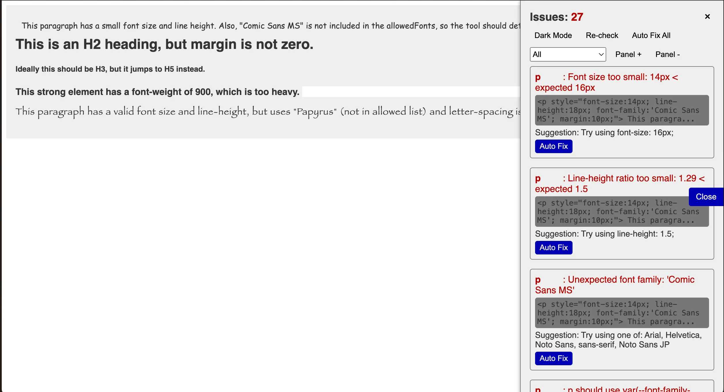
We plan to incorporate a real-time typography checker that monitors consistency across your project. It automatically verifies if your font sizes, line heights, and letter spacing match the defined variables, offering:
Early Error Detection
Spot inconsistent typography right when it’s introduced during development.
Unified Standards Across Teams
Even in large teams, everyone uses the same variables, reducing the risk of design drift.
For UIs with mixed languages (e.g., Japanese and English), variables like --tracking-wide or --tracking-wider can improve readability by providing enough space between characters.
Adapt font sizes and line spacing for different devices—mobile, tablet, and desktop—to optimize readability across various screen sizes.
Pack these variables into a dedicated <typography-palette> component (or similar) to avoid overlooking any sections when scaling to multiple projects.
Harness the power of standardized typography variables to stabilize your product’s text styling. Achieve the perfect balance between readability and development efficiency—it’s a key step toward creating an outstanding user interface!