Simple Naming Convention
For example, variable names like —light-basic-blue or —dark-basic-blue make it clear whether they’re for light or dark mode. Developers can quickly grasp the intended usage without confusion.
In UI design, choosing the right color can be a major challenge. Constantly looking up color codes or making fine adjustments for light/dark modes can significantly reduce development efficiency.
That’s where this page comes in! Here, we’ll introduce how to free yourself from the hassle of defining colors by leveraging an existing color palette. Based on a component-oriented design that uses simple Props and Children, you can intuitively and quickly select colors—allowing you to focus your resources on the “feature implementation” you really want to work on.
Below is a list of “color swatches” utilizing the <color-palette> custom component.
This component displays colors for different themes—like light and dark—all in one place, with a wide range of predefined variations.
No more saying, “I wish this blue was a bit darker!”—you can quickly find a perfect color for your needs!
| Color Name | Light Mode | Basic Mode | Dark Mode | Usage Examples |
|---|---|---|---|---|
| black | Text, Icons | |||
| silver | Subtext, Borders | |||
| gray | Background, Cards | |||
| white | Background, Cards, Text | |||
| maroon | Action Buttons, Links | |||
| red | Error Messages, Alerts | |||
| purple | Highlights, Emphasis | |||
| fuchsia | Focus Rings, Active States | |||
| green | Success Messages, Approval Buttons | |||
| lime | Growth Indicators, Progress Bars | |||
| olive | Backgrounds, Section Dividers | |||
| yellow | Warnings, Attention Alerts | |||
| navy | Headers, Navigation | |||
| blue | Links, Action Buttons | |||
| teal | Information, Tooltips | |||
| aqua | Highlights, Accent Colors |
This palette is designed around unified naming conventions for CSS variables and automatic theme switching. Simply hover (or tap) to see the CSS variable name, copy & paste it, and you can immediately apply that color to any component.
Simple Naming Convention
For example, variable names like —light-basic-blue or —dark-basic-blue make it clear whether they’re for light or dark mode. Developers can quickly grasp the intended usage without confusion.
Accessibility Focus
The palette ensures a contrast ratio of at least 4.5:1 based on WCAG standards. It maintains high visibility across different modes, resulting in a “Win-Win”: users enjoy better readability, and developers save time by not having to fiddle with color choices.
We offer a tool to check the contrast of colors from our palette. Even during development, it allows you to preview color contrast and easily confirm whether it meets proper contrast requirements.
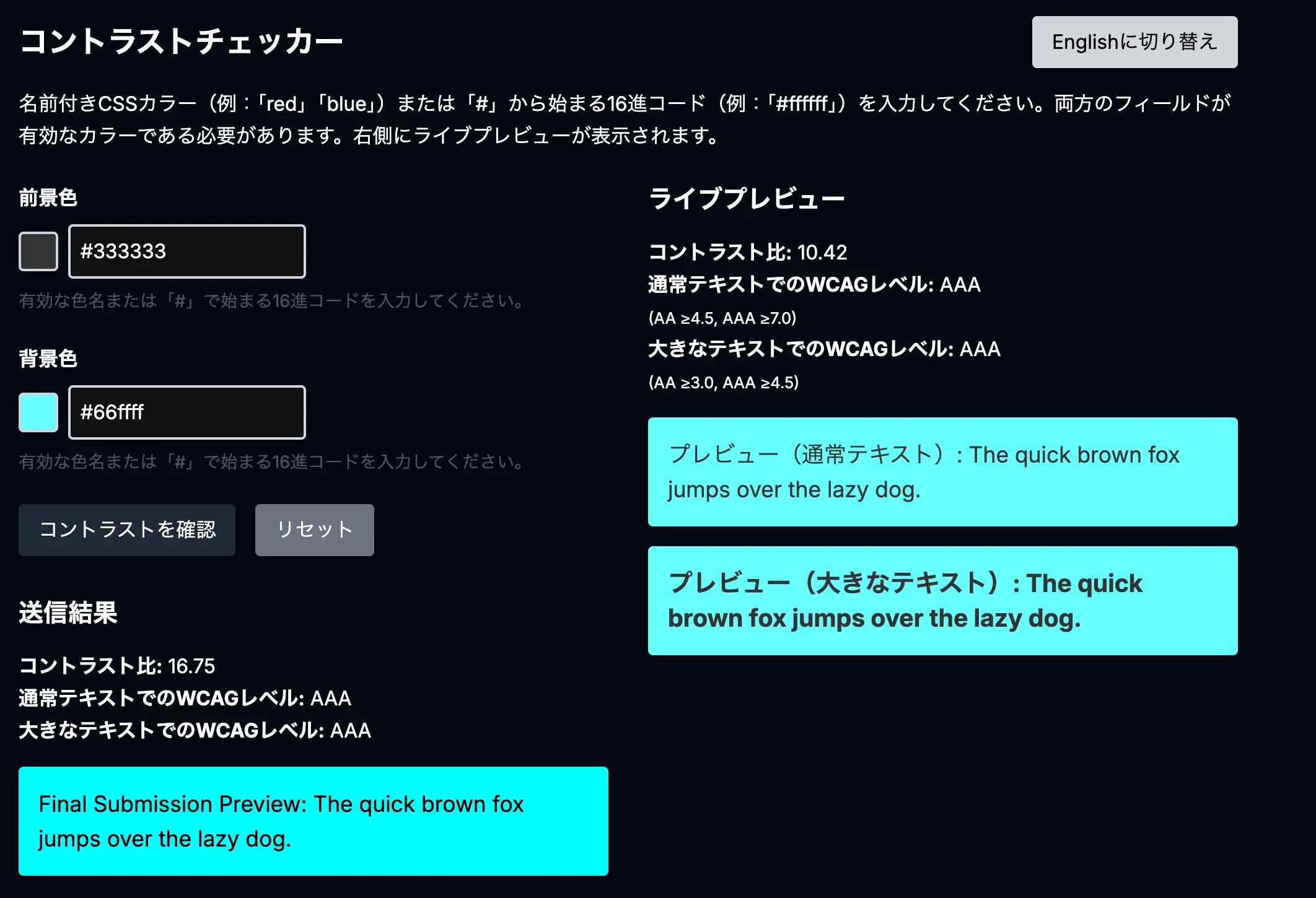
You can check color combinations and see if there are any issues to fix.
Try the Contrast Checker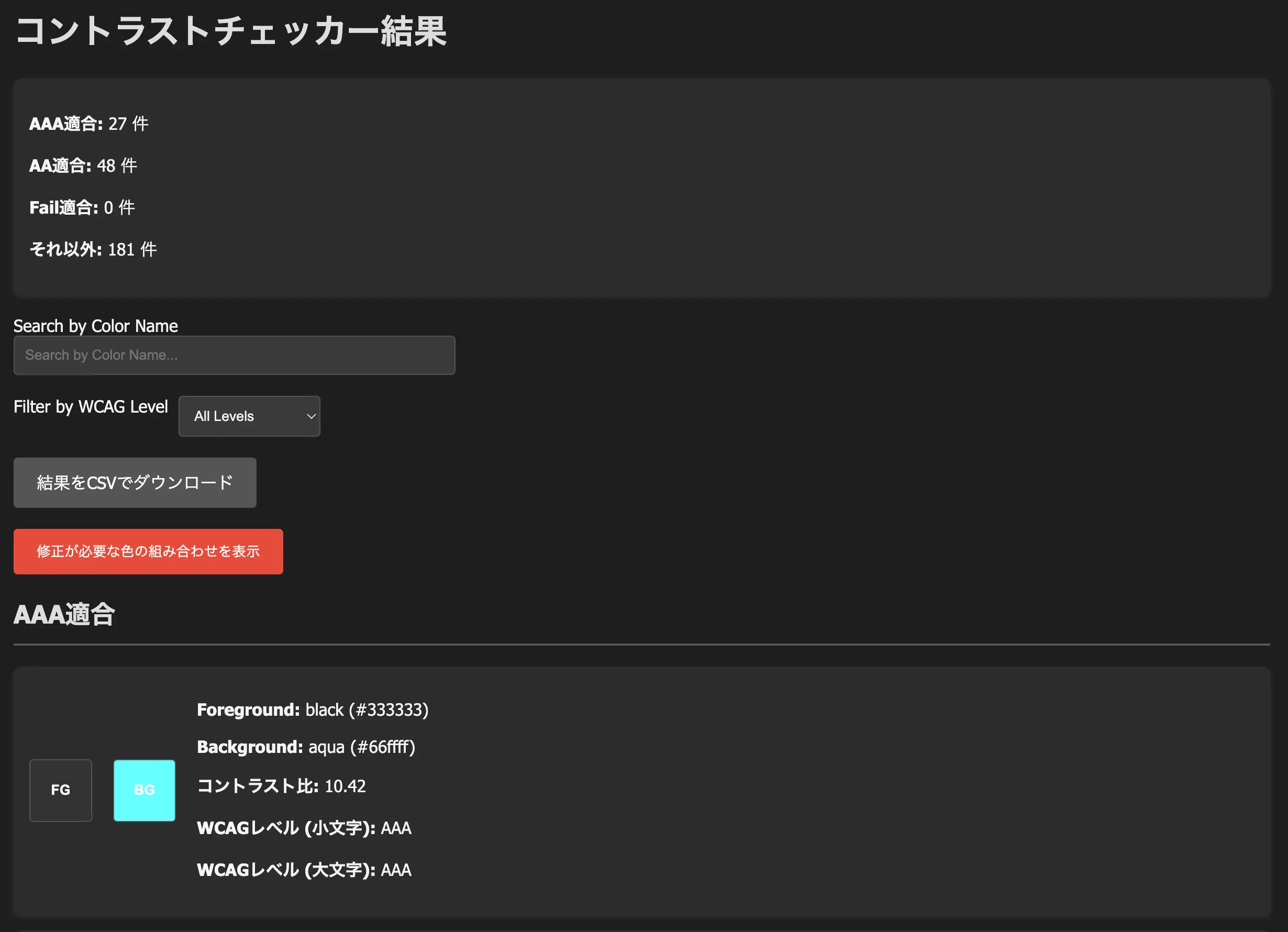
You can also customize combinations from the color palette and see exactly where adjustments may be needed.
Customize Here--dark-basic-blue: #4d4dff
A deep blue that remains clearly visible on a dark background--dark-basic-white: #f0f0f0
A slightly grayish white that’s easy on the eyes, even in dark modeBy calling these variables, the system automatically applies the appropriate color when switching modes. You no longer need to waste time making mode-specific tweaks or rewriting color codes!
In this design system, choosing a color from the palette is your first step to solving color-related concerns at once.
All that’s left is to focus on your core development tasks. The <color-palette> component will be a dependable starting point for managing color usage smartly and intuitively across your project.